
 CasePulse
The form lands in the client's inbox after a crash, and that's usually where the trouble starts. A client sitting in a parking lot on a cracked phone screen doesn't care that the attorney wanted a thorough history, they care that the form feels endless, clinical, and awkward. By the time a paralegal opens the submission, the main question isn't whether the template was elegant, it's whether enough usable information came through to act on today.
That's the standard most medical history form templates miss. They're built like a calm clinic check-in, not like intake for a hurt plaintiff who's tired, stressed, and often not filling out the form alone. A good template has to survive the moment of submission, because that's the point where accuracy, completeness, and follow-up work either get easier or fall apart.
Why Most Medical History Form Templates Fail Injury Clients
A 47-field intake form looks sensible in a conference room. It looks very different when a client is trying to finish it on a phone after a wreck, while waiting for a tow, or while a family member reads questions aloud from the passenger seat. That's where forms lose people, not in the attorney's head, but in the world where attention is already gone.
The client is not in a clinical mindset
Clinical templates assume a patient has time, privacy, and a clear head. Injury clients usually have none of those. They're trying to remember medications, decode medical wording, and answer questions they don't fully understand, often while dealing with pain or shock.
The result is predictable. Fields get skipped, answers become vague, and a paralegal inherits a half-finished form that still needs a phone call. The goal is not to collect everything possible. The goal is to collect the things a paralegal can use within 24 hours.
The form is usually asking the wrong kind of detail
Most office medical forms are designed for diagnosis, not intake triage. They borrow field sets that make sense in a routine exam, then add more because the template is “complete.” That's how you end up with a form that asks for too much family history, too many conditional blocks, and too little about what happened and what needs follow-up now.
Practical rule: if a paralegal can't tell, from one submission, what records to chase next, the template is too bloated.
The first interaction shapes the rest of the case experience
The intake form is often the first real exchange a client has with the firm. If it feels confusing or punitive, that feeling carries straight into the rest of the relationship. If it feels simple, direct, and respectful, the client is more likely to finish it and trust the next step.
The better standard is blunt. Ask only what moves the file forward, then make the rest optional, conditional, or easy to revisit later. For a firm that wants cleaner handoff work, that means the template has to serve the paralegal first, not the attorney's wish list.
The Field Set Your Paralegal Actually Needs
A usable medical history form template should follow the order a case manager reviews it. Start with identity, then the incident snapshot, then the health details that change how the file gets worked. Anything else is decoration unless it earns its place.
Start with the fields that prevent confusion
The first block should identify the client clearly enough that staff don't have to guess. Name, contact details, and emergency contact belong here, and the emergency contact format should be plain, name, relationship, phone number. That's the kind of detail staff can use without a callback.
Then move straight into the incident summary. Not a long narrative, just the basics needed to orient the file. What happened, why they're reaching out, and what kind of visit or issue this relates to. Sample patient forms show how broad the reason-for-visit field can get, so it's smarter to keep it focused and let specialty fields appear only when needed. CareMEDICA's sample patient medical history form is a useful example of how broad a form can become, which is exactly why a plaintiff intake version has to stay disciplined.
Health details should support action, not just completeness
For the medical section, the fields that matter most are the ones that affect records review, conflict spotting, and early case assessment. That means current conditions, medications, allergies, surgeries, hospitalizations, and family history, but not all with the same weight. Some need precision, others just need a screening answer.
Structured medication and allergy entries matter because they reduce ambiguity. A history form should capture name, dose, frequency, and reason for current medications, and it should ask for the specific reaction to an allergy, not just whether someone is “allergic.” Past medical history works better when it includes the year of diagnosis, and surgical history works better when it includes the year and any complications. That level of detail comes straight from practitioner-facing guidance on medical history forms, not from wishful thinking. PatientNotes' medical history form template guidance spells out those exact fields.
Family history should stay light unless the case depends on it. Lifestyle factors belong only where they affect the claim or the medical picture. If the form reads like a full chart extraction, clients will abandon it before the useful fields are done.
| Section | Key fields | Why it matters |
|---|---|---|
| Identity | Name, contact details, emergency contact | Lets staff reach the right person fast |
| Incident snapshot | Reason for visit, short description of what happened | Gives the paralegal a working summary |
| Current conditions | Active complaints, current diagnoses | Helps frame the file and records request |
| Medications | Name, dose, frequency, reason | Reduces follow-up and medication confusion |
| Allergies | Allergen and specific reaction | Supports safe review and record accuracy |
| Surgery and hospitalization history | Year, type, complications, non-surgical hospitalizations | Creates a usable health timeline |
| Family history | Simple screening, “unknown” allowed | Keeps the form honest and finishable |
HIPAA, Privacy, and What Counts as PHI on Your Form
A plaintiff firm does not need a compliance lecture. It needs a working rule for the moment the intake form comes back filled out. Once a client types medical information into the form, treat that content as protected health information. The HIPAA Privacy Rule sets national standards for individually identifiable health information, and HHS says it applies to health plans, clearinghouses, and electronic-transacting providers under 45 CFR Parts 160 and 164. HHS also says individuals can examine, obtain copies of, and request corrections to their records, which matters when intake answers get pulled into the case file. The intake team should be working from that reality, not from the assumption that a web form is just a convenience layer. HHS's Privacy Rule overview, summarized in Freed's intake form resource is the clearest source in the brief on that point.
The practical compliance question is who can see the answers
The issue is not whether the form has a privacy notice at the bottom. It is who on the team can open the responses, how those responses move, and whether the intake path stays inside a controlled workflow. HHS notes that the Privacy Rule has continued to change, with major updates as recently as April 26, 2024, so the firm cannot assume last year's process is still enough. The legal and operational baseline keeps shifting, which means the form design has to assume review, access control, and record handling will be tested. guide for hipaa compliance in healthcare is useful here because it frames the software side of the problem, not just the policy side.
That affects day-to-day operations. A form collected for a case cannot be treated like a personal note. It needs controlled access, careful sharing, and a clean retention path. If the team cannot explain where the form lives and who touched it, the process is too loose.
Consent should be short, visible, and understandable
Clients do not read walls of legal text on a phone. A one-line checkbox at the top, paired with plain language about what the firm is collecting and why, gets farther than a dense block of legalese nobody finishes. That matters when the same client is trying to attach records, answer medication questions, and get back to work.
The risk points are ordinary but real. Storing intake in personal email creates exposure, and forwarding the information to an outside records vendor without the right agreement creates another. Firms that want a cleaner workflow usually start by tightening access and putting the intake path inside a secure client portal, such as the kind described in CasePulse's secure client data overview. That does not remove responsibility, it makes the workflow easier to control.
The same principle applies when the firm needs outside help. A solid HIPAA process is not a banner at the top of the page, it is how the data moves after submission.
Phrasing and Conditional Logic That Lift Completion
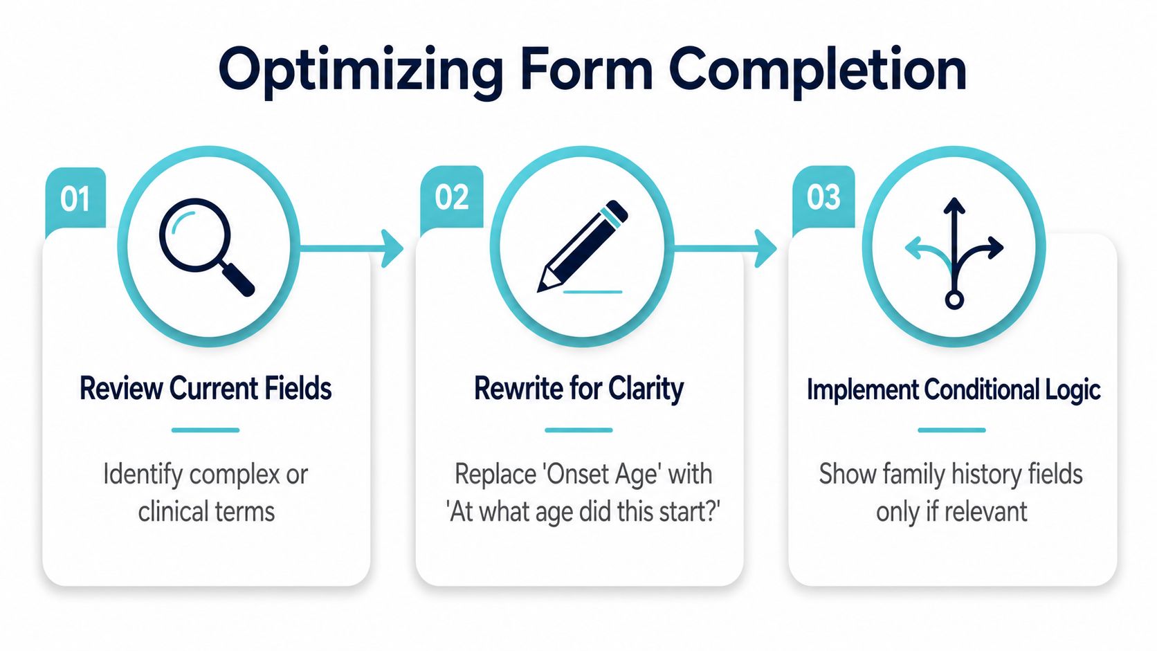
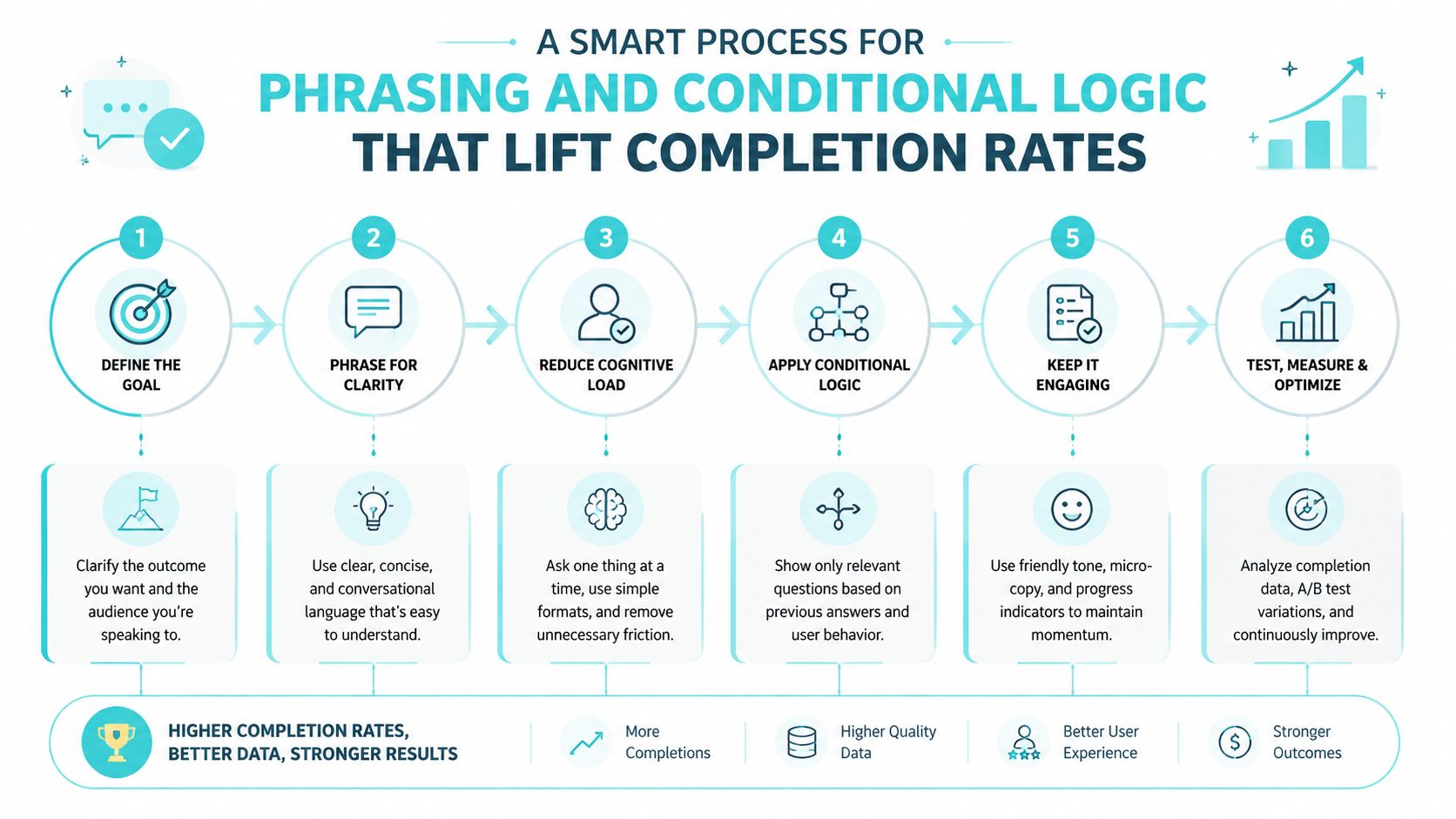
Clients finish forms when the wording sounds like a person, not a chart. A field labeled “Onset Age” asks for translation. A field that says “At what age did this start?” gets answered. That difference matters when the client is stressed, injured, or helping fill out the form for someone else.
Rewrite the words before you add more fields
The fastest fix is to strip out medical shorthand. “Chief Complaint” becomes “Main reason for today's visit.” “Medication adherence” becomes “How do you take this medicine?” and “etiology” should probably disappear altogether. The plain-language version takes less time to answer and reduces the chance that a client bails because the form feels like a quiz.
If a question sounds like it came from a chart note, rewrite it.
The same rule applies to sensitivities. For allergies, ask what the allergen is and what happened when they were exposed. For surgeries, ask what procedure was done, about what year it happened, and whether there were complications. The more the form sounds like a real conversation, the fewer blanks you get back.
Make conditional logic do the heavy lifting
Conditional logic works best when it prevents clutter. If the client selects work injury, show the workers' compensation block. If they list a minor, show the pediatric vaccination section. If they choose motor vehicle accident, show questions about the vehicle type, seatbelt use, and whether there was another driver. If they choose slip and fall, ask where it happened and what surface was involved. If they select a work incident, ask where on the job the event occurred and whether a supervisor was notified.
That branching structure keeps the form short for everyone who doesn't need the extra questions. It also keeps specialty fields from wrecking completion, which is the trade-off experienced intake teams already know. Extra fields tend to produce more incomplete responses, so specialty blocks should only appear when there's a real reason for them.
A quick accident section that actually works
A usable intake block can be short and still useful:
- Motor vehicle collision: ask about vehicle type, point of impact, and immediate symptoms.
- Slip and fall: ask what caused the fall, where it happened, and whether anyone witnessed it.
- Work incident: ask what task was being done, whether equipment was involved, and whether the client reported it.
That's enough to orient a paralegal without making the client feel like they're drafting a deposition summary. It also keeps the form aligned with the fact that not every case needs the same detail on page one.
Mobile and Accessibility Habits That Prevent Drop-Off
Most plaintiffs will finish the form on a phone, not a laptop. That means the layout has to feel easy on a small screen, or the form is dead on arrival. Single-column design, tap-friendly controls, autocomplete on address and medication fields, and a save-and-resume option do more for completion than another paragraph of instructions ever will.
Make the screen feel easy before you ask for anything sensitive
Large tap targets matter because shaky hands and small screens are a bad combination. Good contrast matters because tired clients don't squint through low-contrast gray text. Screen reader labels matter because some clients won't be reading the page the way the designer expected.
Plain language also belongs here, not just in the question text. A form that reads at a very basic level is easier to finish for everyone, including caregivers and people who are juggling pain, childcare, or a work shift. The form should never punish the user for being on a phone.
Let clients show you instead of type every detail
The biggest usability win is to let clients upload a photo of their medication bottles and surgical records instead of forcing them to type every line from memory. That one choice removes a pile of friction. It also gives staff a better starting point when details are blurry, labels are tiny, or the client can't find the exact dosage.
A phone photo is often better than a guessed transcription.
That's especially true for medications. A client may know the pill color and the pharmacy but not the full spelling or dose. A photo beats a blank field and usually beats a rough guess.
Keep the form short enough to finish in one sitting
Length and friction are closely linked. The more fields a client sees up front, the more likely they are to stop halfway through. Save-and-resume softens that problem, but it doesn't excuse poor structure. The better move is to keep the default path lean and let the form branch only when needed.
If the firm needs a starting point for a cleaner workflow, a secure portal approach like the one described in CasePulse's client portal overview is built around mobile access, file upload, and status visibility. That's a workflow decision, not a design flourish, and it fits the way clients submit information.
Deploying the Form Inside a Client Portal
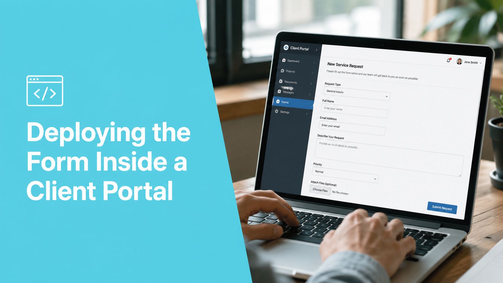
An emailed PDF is easy to send and hard to manage. A web form on the firm site is better, but it still leaves the client outside the workflow. A fillable form inside a secure client portal keeps the submission, the files, and the status in one place, which is where paralegals want the work to land.
The delivery channel changes completion behavior
When clients sign in once and see the form, file upload, and message thread together, the process feels contained. That reduces the back-and-forth that usually clogs inboxes. It also lets staff see whether the form is started, stalled, or done, which is a lot better than guessing from a missing reply.
Paralegals working inside systems like Needles, Neos, LawBase, or Litify shouldn't have to bounce between the case record and a string of emails just to know whether a medical history form came back. A portal that connects directly into the existing case management flow keeps the work where the team already lives. That's the practical advantage, and it's the reason this isn't just a technology preference.
Automated reminders beat manual chasing
Manual follow-up calls waste time and usually happen too late. Automated reminders keep the form visible without making staff remember every open loop. For intake work, that matters because clients don't always start the form when staff expect them to, and they rarely finish it on the first try.
A portal also makes it easier to support attachments. Clients can answer the form, upload records, and return later if they need a medication bottle or a hospital discharge sheet. That's a smoother experience than forcing them to hunt through email threads for links or re-open a PDF on a phone.
The workflow stays intact when the firm stays inside its system
The primary benefit isn't that a portal looks modern. It's that the team keeps working in the same place while clients act from any device. That reduces scattered tasks, keeps status visible, and gives the paralegal a cleaner submission to review when it finally lands.
For firms comparing options, the starting point should be whether the form can live inside the same intake path as the rest of the case. If it can't, the firm is usually just creating another place for data to get stuck.
The Family History Trap and What to Do Instead
Most medical history form templates ask too much about family history and expect too much precision from clients. People often don't know the exact diagnoses of relatives, the ages when symptoms started, or the causes of death. When a form demands that level of detail, the section becomes the one most likely to come back incomplete.
Treat family history as a screening prompt, not a research assignment
The best answer to uncertainty is not a blank field. It's a valid response like “unknown” or “not sure,” followed by a staff follow-up only when the case depends on a hereditary issue. That keeps the form honest and prevents clients from guessing.
This is the part many guides skip. They tell firms what to ask for, but not what to do when the client can't reliably provide it. In real intake, that gap matters because specialty forms can push for long, condition-specific family histories while the client is already struggling to finish the rest of the page.
Contrarian truth: a more comprehensive family-history section can lower accuracy if it asks for details the client can't supply.
A lighter replacement block works better
A better version is short and direct:
- Do any close relatives have major health conditions you know about?
- If yes, what condition do you know about?
- If you're not sure, write unknown.
That keeps the field useful without pretending the client is a medical historian. If the case hinges on a hereditary factor, staff can follow up later, when they have context and time.
A managing partner can audit the whole form in a week
The cleanest reset is operational, not decorative. First, cut every field a paralegal hasn't used in the last 30 cases. Then rewrite the clinical phrasing into plain language. After that, add conditional logic to specialty blocks and enable mobile save and resume. Push the form through a secure portal that integrates with the existing case management system, set up automated reminders, and run a one week pilot with five new clients.
That sequence is enough to expose what's helping and what's just making the form longer. If the family-history block keeps coming back blank, that's not a client problem. It's a design problem.
For firms that want a template reference point, CasePulse's family law client intake form shows how structured client intake can be organized without pretending every field belongs on every case.
CasePulse gives firms a secure client portal that supports fillable forms, file sharing, messaging, and real-time status inside existing case management workflows. If your medical history form template keeps getting stuck in email threads or coming back half-finished, CasePulse is worth a look as a way to move the submission into one controlled client path and make the handoff easier on your team.